JSTOR Support Information Architecture (IA, Product Design)
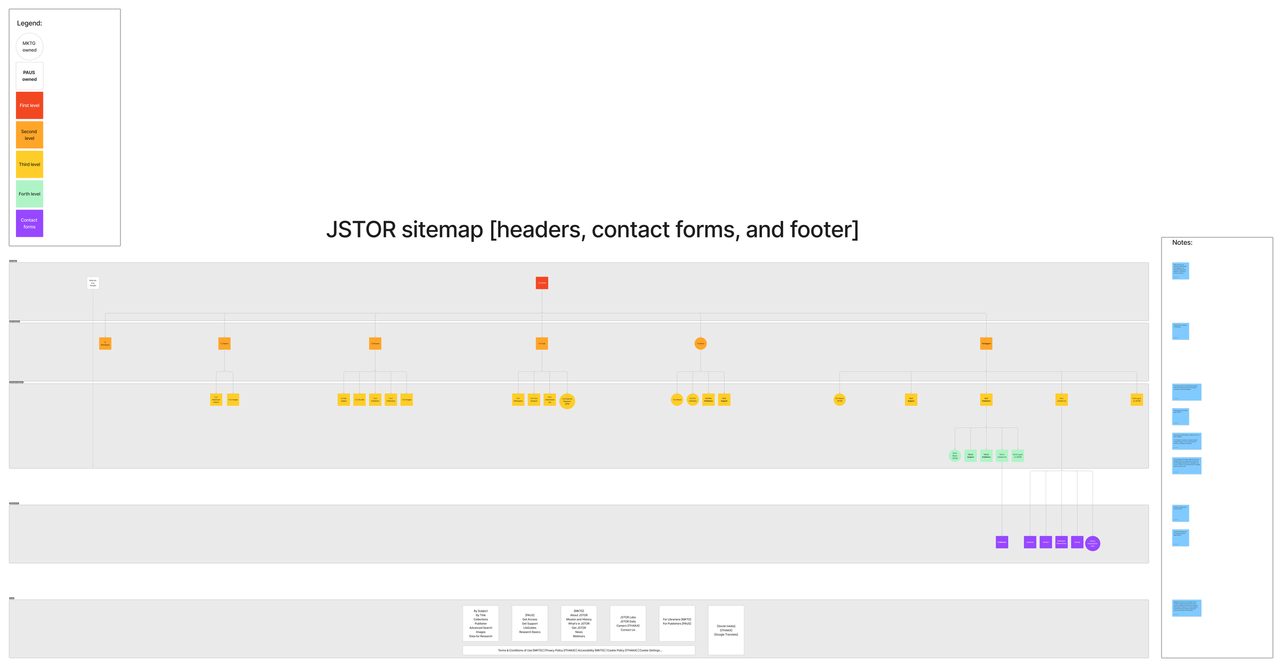
Context: currently there are 3 high level experiences in the JSTOR ecosystem— the JSTOR main site navigation, the JSTOR marketing pages, and the Support sites (JSTOR, Artstor, JSTOR Forum and Publisher support) hosted in Zendesk (ZD). The header navigation differs across each experience.

Problem statements
As a JSTOR user, I want the ability to easily navigate the site and have the site provide a strong point of view as to what is most important to me and how to access it.
As a user, I want a simple and clear way to contact JSTOR so that I can get a resolution to my problem with as few steps as possible.
Implementation details
Based on Information Architecture (IA) best practices, I performed the following activities:
High-level scoping audit
Structural audit
Produced a recreation of the current sitemap
Produced a new sitemap and related recommendations
The Support site header IA implementation steps led to identifying opportunities to positively impact the Contact forms information architecture:
Updated current sitemap that incorporated feedback from design review
Google Analytics (GA) data regarding common user workflows between the JSTOR homepage (including Contact forms) and the JSTOR Support site
2 user flows highlighting how end-users may be currently using the sites’ navigation
Produce Contact forms prototypes and related artifacts
Success criteria
Support site header IA: perform an audit of the current information architecture and provide recommendations in terms of proposed taxonomy, structural, and visual modifications.
Contact forms IA: migrate the JSTOR Contact forms to ZD so that the Operations and Support teams can have more control over these forms and easily make updates to the content and structure.
Recommendations
Per IA and accessibility best practices, I presented 3 concepts for a new Support site header and received feedback at design review— the group aligned around a specific design that leverages the order of the links in the JSTOR main site navigation while also consolidating the Support sites under a drop-down menu.
In terms of accessible design, consistency has the opportunity to build trust with end-users, helping them to situate themselves more effectively in the JSTOR system, reducing confusion and improving access.
Consulting with the Data Intelligence (DI) team led to sampling usage with Google Analytics to inform 2 user flows. Although the GA Segments only sample between 1-2 percent of sessions during a given time period, typically if a user visits the Contact page in the first or second interaction with the JSTOR experience, this will result in a drop-off/exit. I proposed consolidating the existing Student, Independent Researcher and Faculty contact forms into 1 form, but supporting separate Administrator and Publisher contact forms by migrating them from the Contact page owned by the product teams to ZD.
Design
I presented my recommendations to the design department and acted upon their feedback. I leveraged the appearance of the existing Publishers contact form, the ZD Garden design system components and our Pharos typography to produce prototypes of ZD hosted contact forms.
Opportunities
User flows were selected over (customer) journey maps since the former focuses on steps a user takes while the latter also includes other dimensions such as a user’s potential feelings and pain points (therefore better informed by user research).
A UX study/report evaluating the existing IA and the proposed changes could include a card sorting activity to determine the labeling. Furthermore, an automated or quantitative audit would produce analytics that could be leveraged to identify pages with low usage that can be removed or more easily surfaced up. Finally, this output could be augmented with a manual review (and complement an existing SEO audit) in order to create an inventory that informs a relabeling effort.


